European Students' Union Case Study
The European Students’ Union (ESU) is the umbrella organisation of 45 National Unions of Students from 38 countries. The National Unions of Students are open to all students in their respective country regardless of political persuasion, religion, ethnic or cultural origin, sexual orientation or social standing.
1. Pre-Forci times
The organisation’s existing website was information heavy and the design was outdated by today’s standards. It had also been built on a platform that limited the client’s ability to modify many of the elements.
2. Understanding and specifying the ESU goals and requirements
Working closely with the ESU team to fully understand their requirements, we suggested multiple updates to the information structure of the website. This was a complicated process that required our team members to immerse themselves in the organisation’s work in order to understand what the most important parts of the website were from their perspective. After outlining the structure of the website, we started to discuss the graphic design.
The organisation already had a nice, modern logo which gave us a good foundation for selecting the colour scheme of the website. The next step was preparing the wireframes.
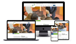
The homepage was particularly challenging because it had to present a lot of information in a well-structured and pleasing way, so we went through several iterations. The rest of the wireframes were straightforward and didn’t take as much time.
3. The design process
One of the most complex parts of the design was the logo. As it was relatively big and round and included a short text we came up with the idea of incorporating its background as a design element, which turned out to be an excellent solution that both the client and our team were pleased with on the first attempt.
We continued working on the graphics, and after a few iterations, we had a desktop design on all the key pages. To keep costs to a minimum, we advised the client not to design every single page type, because once our front-end editors had the most common pages designed and approved they could combine the visual elements when creating the rest of the pages. In retrospect, this turned out to be an excellent decision, and we had no problems with the website visuals.
After completing all the desktop designs, and after the client had approved them, we spent our time designing the responsive version of the website. We discussed with the client which mobile device was the most important target for them. As usual, it was smartphones. This was why we suggested not designing the tablet viewports and instead leave it up to our front-end developers to cover it. In our case, this was a good decision because all our front-end developers have graphic design experience and can easily make good calls when we’re talking about aesthetics.
4. Coding
With the design ready, we began the task of transforming it into an active web page. For maximum clean markup, we decided not to use any framework for the process. This allowed us to slice the design in the best possible way, eliminating the overhead of frameworks like Bootstrap or Foundation and allowing us to build our markup more semantically than we could have done using a front-end framework. For the styling, we used SASS, and as the website didn’t require any complicated interactions on the front-end, we used jQuery for the JavaScript functionality.
In parallel with the front-end, we started to prepare the WordPress installation. WordPress is the standard choice for this kind of project as it provides one of the best content management functionalities, and when developed consciously, it is a solid foundation for feature improvements. As every project is different, we don’t like using starter themes for our WordPress projects, and this one is no exception. One of the things we aim to provide for all our customers when building WordPress functionality is the freedom to update all website content without breaking the website. This is a really important part of building long-lasting, appealing websites. On quite a few occasions, we’ve seen good-looking websites ruined over time by bad content management. Fortunately, this is something we can control, and instead of building websites with one big text area, with mixed content and HTML markup, we actually split all content into different self-contained sections of the page administration, where the user can update them without any coding knowledge. These improvements are, of course, time-consuming, but our experience shows that they are well worth the effort. We applied the same principle to the ESU website, which was particularly complicated as a lot of the content was presented in multiple pages. In the end, we created a good system that allows the client to select the relations for all pages and articles with ease. Which proved to be the best possible way for clients to manage their content in the long run.
So with the front-end ready, the WordPress prepared for the new theme, and the content management strategy created, we started building the WordPress theme. First we focused on the home page then moved on to the most frequently used pages. This optimised the process because, with the common pages ready, our content managers started to migrate the content from the old website to the new one. For other projects, we usually create automated scripts to migrate the content, but in this case, we didn’t have access to the old website’s code or database, which meant we had to migrate it manually. This was actually a pretty good process for the client as the old content had multiple inline styles inside every page, the images were missing alternative tags and many links were broken. Our content managers fixed all these errors when migrating the content, which resulted in immaculate, well-structured, appealing SEO-optimised content throughout the website.
5. Releasing
When we finished building the website and migrating the content, we released it on one of our servers together with all the client’s sub-sites. This way, everything was in one place, and the client was assured that they have complete access to all the websites as well as 60 days’ complete backup to all the website files and databases.
6. Training
At the end, we held a training session with the ESU team and their content managers on how to add, update and control the appearance of all website content.
7. Feedback
The overall result was that together with the ESU we created a really easy-to-use, modern website that showcases their organisation and allows their content managers to work with ease on the news, events and updates. The design received positive feedback from all their visitors, and the complete response helped the organisation’s website to be presented on all kinds of devices.